Insights
Daybreak enables users of all backgrounds to get answers to their questions about data. With easy-to-use tools like natural language answers and structured query wizard, users without a background in database technology can generate datasets with the information they need. Insights adds additional value to Daybreak by enabling users to take the results of queries built with these tools and build visualizations that display those results in various forms such as line, column, or donut charts. By adding Insights to the queries created in Daybreak, users can see patterns in the data they have selected and make those Insights available to other users when they run the queries shared with them.
Because Insights are meant to be shared with users who may not be familiar with the data they are displaying, it is extremely important that Insights be given specific and highly descriptive titles. For example, although the title "New accounts" may be meaningful to the creator of the Insight, someone unfamiliar with the query used to generate the result set for that Insight may need additional information. A better title would be as specific as possible to the query from which the result set is generated. It may be helpful to include the natural language phrasing of the query. For example, "New mortgage accounts created in the last month."
Tip
Make sure the title of your Insight clearly describes the question being used to select the data used to render the visualization. This will help the people you share your visualization with to immediately understand what is being shown!
How to Use it
Insights exist in the Daybreak webapp as a tab in the results area of a Daybreak query. This is because Insights visualize the results of a query.
When a user asks a natural language question, the results area of the web app is immediately populated with the results of the query that is returned by the natural language service.
Queries that are manually created with either the Query Wizard or SQL builder will need to be manually run by clicking the "Run" button in the upper right corner of the Data Builder tool.
Similarly, saved queries, whether they are manually built or generated by natural language queries will always need to be manually run. This is because the data in the datamart may have changed since the last time the query was modified and so the query will need to be run again to refresh the data shown in the results area.
Once a query has been run, the results are shown at the bottom of the data builder tool. Scroll down to review the results. It is helpful to check the number of results displayed in the "Row Count" field before creating or viewing Insights queries may sometimes not return any results. Common reasons for empty result sets are either a lack of data or improperly formatted queries, especially query conditions involving dates.
If the data returned in the results area appears adequate, click the "Insights" tab to open the Insight's dashboard. For newly created queries, the dashboard will be empty. When viewing a saved query, previously saved Insights will be redrawn from the refreshed result set.
Creating an Insight
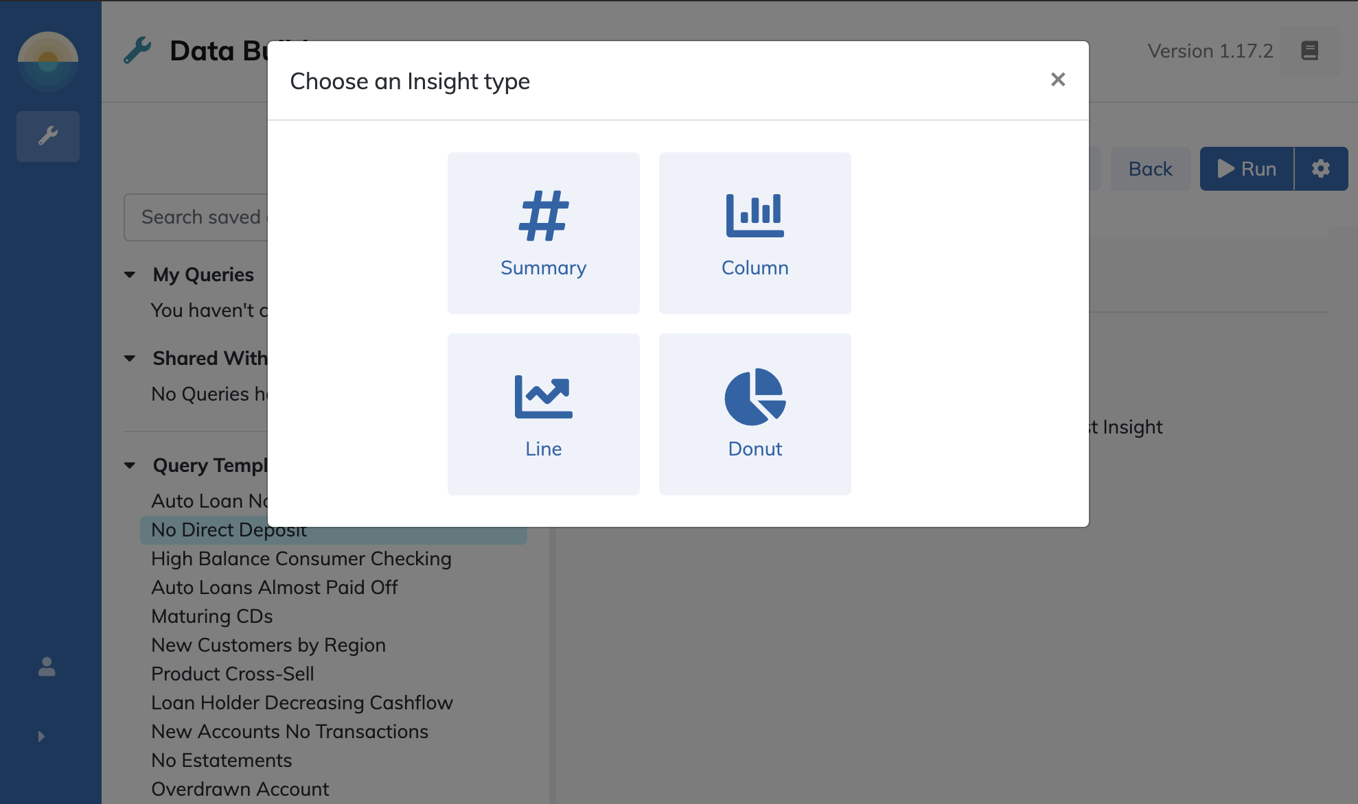
To add a new Insight to the Insight's dashboard area, click the "Create Insight" button. This will bring up a modal to select the type of Insight to create based on the kinds of fields in your result set:
Note
The kinds of Insights available on this screen will vary based on the data included in your result set. For example, if you do not have a date or time field in your results, you will not see the line chart option since line charts only display time and date fields.
At any time you can exit the Insight creation process by clicking the "X" icon in the upper right of the Insight creation modal.
Insight Types
There are four types of Insights that are designed to represent different types of data in visual form. Because each type is designed to display data of a specific type, the fields that can be displayed by each will be restricted to fields in the datamart with the kind of data that Insight type can display. If the desired field is not present in the settings for the type of Insight you have selected, you may need to create a different type of Insight to visualize that field. Simply cancel out of the Insights creation modal by clicking the "X" in the upper right and start over.
| Type | Primary Data Type(s) |
|---|---|
| Summary | A single numerical aggregation |
| Column | Numerical aggregations by category |
| Line | Numerical aggregations by date |
| Donut | Count of records by category |
Hint
If a field is missing from the options for the Insight type you have selected, you may need to select a different Insight type to display that data.
Summary
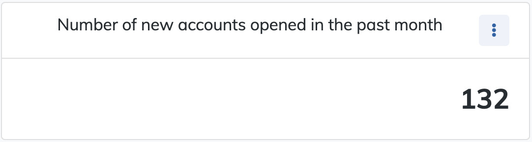
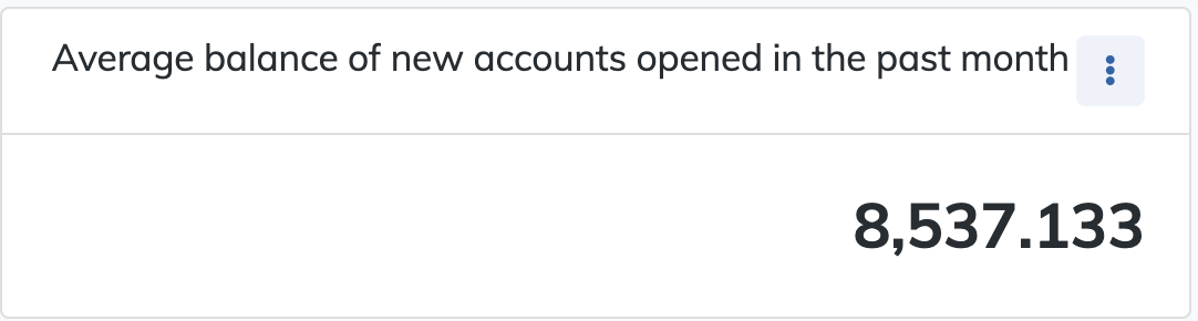
Summaries are numerical displays of a single value generated by a count of rows in the result set or an aggregation calculated from a specified field. Summaries are useful for providing a simple numerical statistic, like the number of results or the average current checking balance for customers in the result set.
To create a summary Insight click the Summary icon to select that type.
To display a simple count of the records in the result set, enter a sufficiently descriptive title to let users unfamiliar with the query about what the data point displays, and select the "Count all records" radio box.
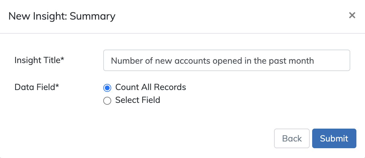
Click "Submit" to create the Insight and view the results in the Insights dashboard.
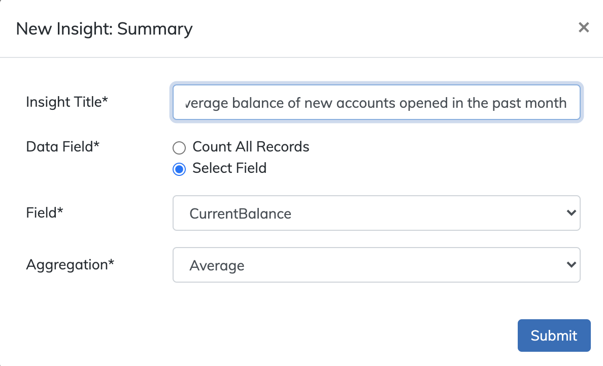
In addition to the simple count of records, summary Insights can display a count of non-empty values or a calculated value based on a selected field. To display such an aggregation figure, create a summary Insight and select the "Select field" radio box. This will display two additional fields: the field selector dropdown ("Field") and the aggregation method dropdown ("Aggregation").
Depending upon the data type of the field selected in the "Field" dropdown, a different set of aggregation methods will be displayed as possible calculations to perform upon the selected field.
- Count not empty: (
Text,Yes/No, andNumberfields) Returns the number of non-empty fields. For example, the number of customers in a query with a non-emptyDaysSinceLastCampaignContactfield would indicate how many have already been contacted by a marketing campaign. - Minumum: (
Numberfields only) Returns the smallest result in a set. For example, what is the lowestCurrentCreditScorefor customers with auto loans greater than a certain amount? - Maximum: (
Numberfields only) Returns the largest result in a set. For example, what is the highest credit score is for customers with checking account balances under $100? - Average: (
Numberfields only) Returns the aggregate mean of all results in a set. For example, what is the average credit score for customers without a mortgage account? - Sum: (
Numberfields only) Returns the sum of all the values in a result set. For example, what is the sum total of all the CD accounts for customers with aCDAccountBalanceover $10,000?
In the present example, we want to display the calculated average of the CurrentBalance field for the records in the result set.
To complete creation of the Insight, click "Submit" and view the results.
Column
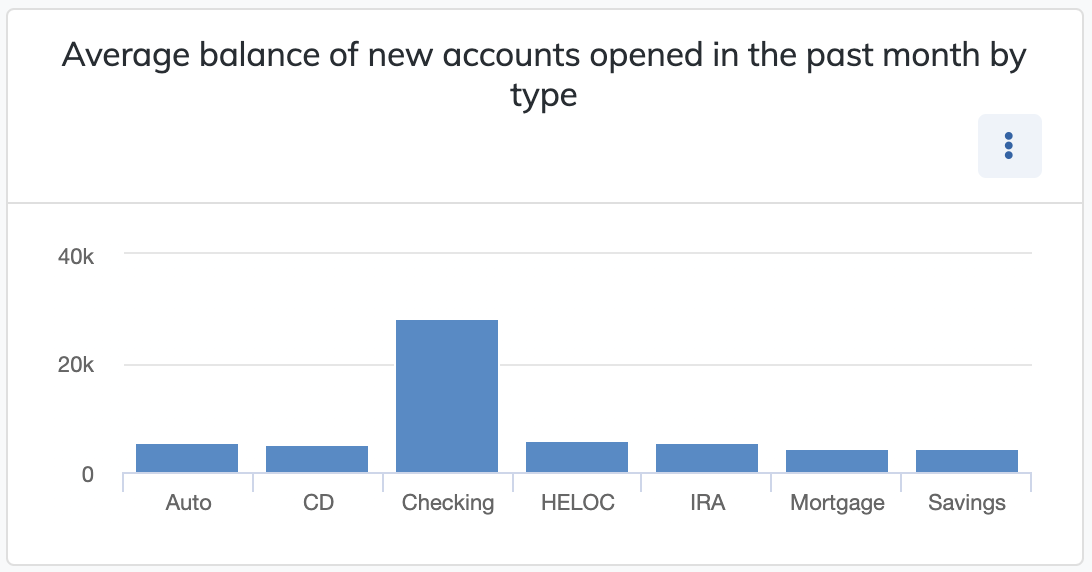
Column Insights are column charts designed to display numerical data grouped by category. Because column charts group data on the horizontal axis into categories, users can only select an enumerated field for the horizontal axis. In other words, you can only select a field that must have one of a set of possible values, such as a Yes/No field (HasSavingsAccount) or an enumerated string field (e.g. ProductType where the value can only be one of a set of banking product types like "Checking", "Savings", or "Mortgage").
The height of each column will be determined by the value of the vertical axis. At its simplest, this can be simply the count records in each category defined by the value of the horizontal axis (for example, Yes and No columns for a Yes/No field). However, the Y axis can also display a calculated aggregation such as the CurrentBalance field for the records grouped by the categories of the X axis.
The aggregation operators for column charts are the similar to the other types of Insights except column charts do not allow the Count not empty operator.
- Minumum: (
Numberfields only) Returns the smallest result in a set. For example, what is the lowestCurrentCreditScorefor customers with auto loans greater than a certain amount? - Maximum: (
Numberfields only) Returns the largest result in a set. For example, what is the highest credit score is for customers with checking account balances under $100? - Average: (
Numberfields only) Returns the aggregate mean of all results in a set. For example, what is the average credit score for customers without a mortgage account? - Sum: (
Numberfields only) Returns the sum of all the values in a result set. For example, what is the sum total of all the CD accounts for customers with aCDAccountBalanceover $10,000?
To display a column chart plotting average balances for new accounts by type, create a new Insight and click the "Column" icon to create an Insight of that type.
After giving it a sufficiently descriptive title, select the ProductType field for the horizontal axis and select the "Select field" for the vertical axis.
This will display two additional dropdown menus. From the "Field" dropdown, select the CurrentBalance field and for the "Aggregation", select average.
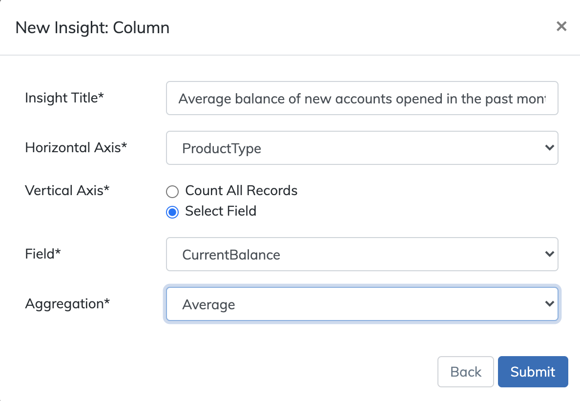
When you have finished specifying these settings, click "Submit" to create the Insight and view its results.
Line
Line chart Insights are plots of points across a time series on the horizontal axis. A time series is a plot of data organized across equally spaced points in time. Because line graphs represent data over a set of points in time, Daybreak restricts the fields that can represent the horizontal axis to only those fields with dates as their value. An example of such fields would be the OpenDate field. In addition, a grouping of the horizontal axis can be specified by selecting a periodic interval:
- Daily
- Weekly
- Monthly
- Quarterly
- Yearly
The value of the vertical axis can be simply the count of all records broken down by the periodic grouping interval (for example, the number of accounts in a result set with an OpenDate grouped by day/week/month/etc.). As with column charts, however, this type of Insight can also display a calculated aggregation based on a field selected by the grouping interval.
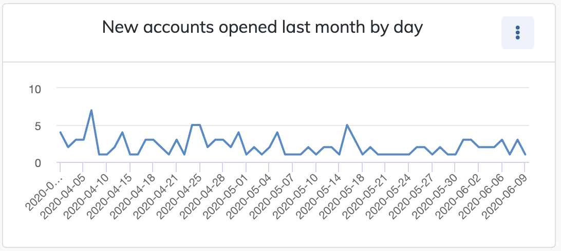
To display a line chart of new accounts created in the past month by day, create a new Insight and click the "Line" icon to create an Insight of that type.
After giving it a sufficiently descriptive title, select the OpenDate field for the horizontal axis and select "Day" from the "Grouping" dropdown to group results by that interval.
For a simple count of records opened by day, select "Count all records" (or select a field to perform a calculated aggregation on in the same manner as column Insights).
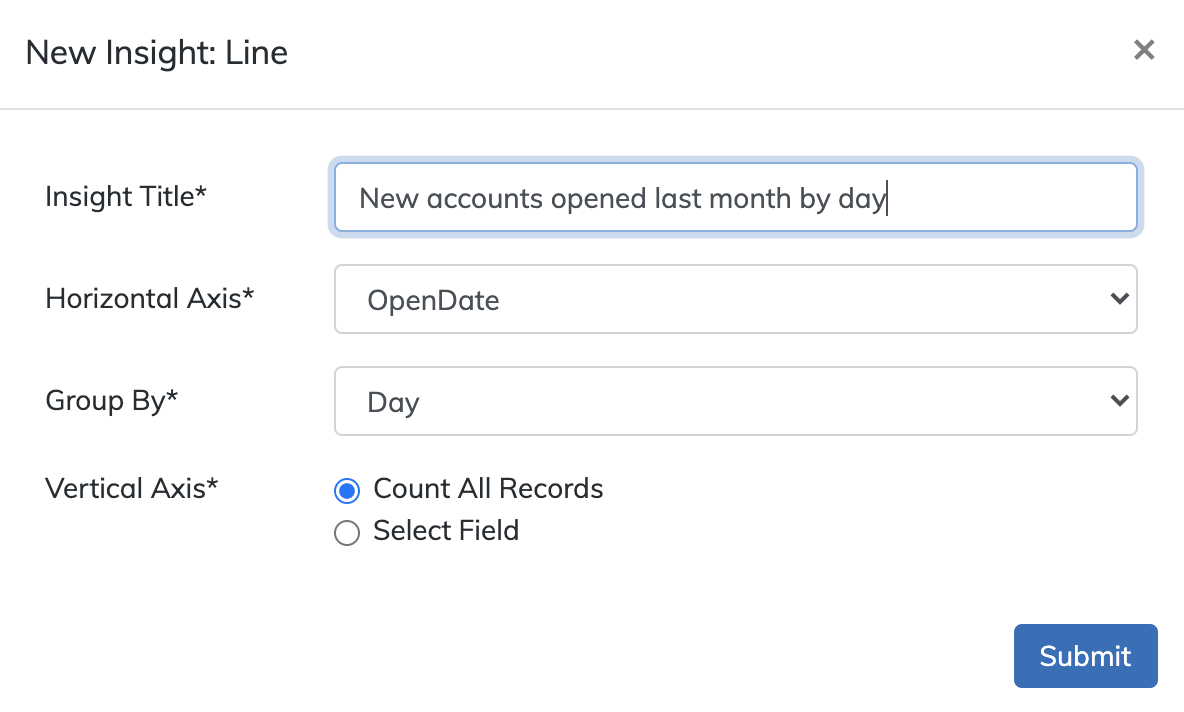
When you have finished specifying these settings, click "Submit" to create the Insight and view its results.
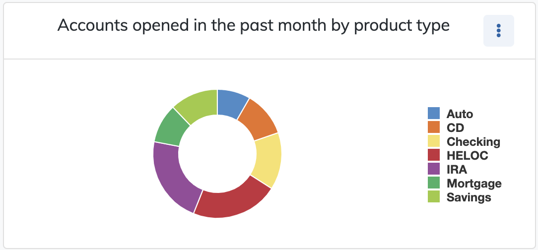
Donut
Donut chart Insights are visualizations of proportional distributions by category. Because of their distribution, donut charts can be used to display the same types of data as column chart Insights, but the categories will be displayed as angular segments of a circular figure rather than columns. The values of each segment will be determined by the category in the primary data field, and the share of the whole circle will be determined by the number of records in each type.
Because donut charts require their primary field to have a limited number of possible values, users can only select an enumerated field for a donut chart. In other words, you can only select a field that must have one of a set of possible values, such as a Yes/No field (HasSavingsAccount) or an enumerated string field (e.g. ProductType where the value can only be one of a set of banking product types like "Checking", "Savings", or "Mortgage").
To create a donut chart, click the "Donut" icon from the Insight type modal.
After entering a clear and specific description of the Insight in the title field, click the "Field" dropdown and select a field from the list of enumerated fields in the result set that will be used to define the segment groups for the chart. Many of these fields are Yes/No fields providing just two segments, but a few contain multiple segments (e.g. ProductType).
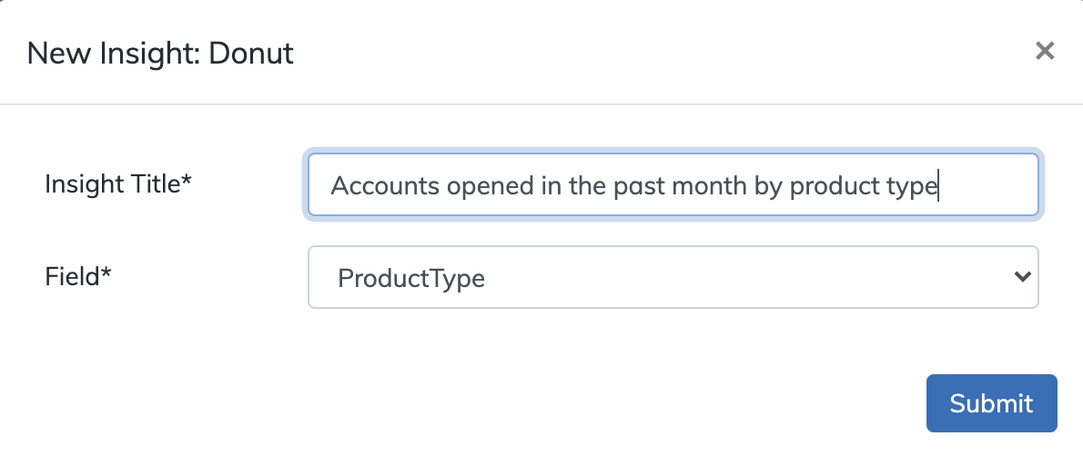
Once the desired title and field have been set, click "Submit" to create the Insight.
Saving and Retrieving Insights
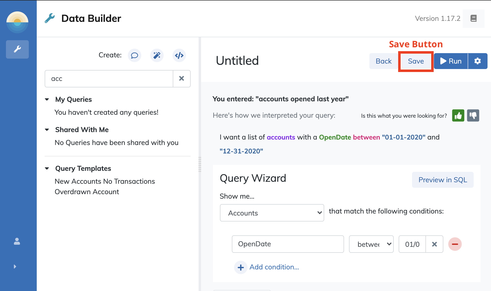
Insights can be saved, retrieved, and shared with the queries they are created for. When you have created the desired Insights for a particular query, save the query by clicking the "Save" button at the top of the Data Builder tool.
Saved queries are displayed in the "My Queries" area of the Data Builder. Once a query is saved, it can be shared with other users by clicking the "Dots" icon in the upper right and clicking "Share".
Saved queries will include the Insights created by that query's owner and those can be viewed by users who view the query by opening it from the "Shared with me" area of the Data Builder tool.
When users open a saved query (whether they are its creator or someone with whom the creator has shared the query) they will need to run the query again by clicking the "Run" button to refresh and display the query results in the results area of the Data Builder tool since the data may have changed since the query was created.
Users can even modify the Insights in queries saved with them. Only the owner can save those changes to the original query, but users with whom the query is saved can use the "Save as" option to save their changes under a different name and even share those changes back under the new name with the creator of the base query.